UX Process
While comfortable adapting to any team's process, here is the sequence of work I've found success with along with each step's objective. I've found this is to be the surest path from research to finished designs.
Step 1: Define Need and Choose Research Method
Objective: Choose the best research method to understand the user's goals and difficulties.
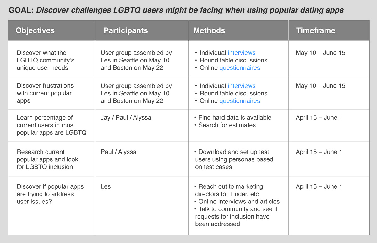
Research plan
In this example, I outlined who we would be speaking with, who would lead the process, and what research method we'd use.
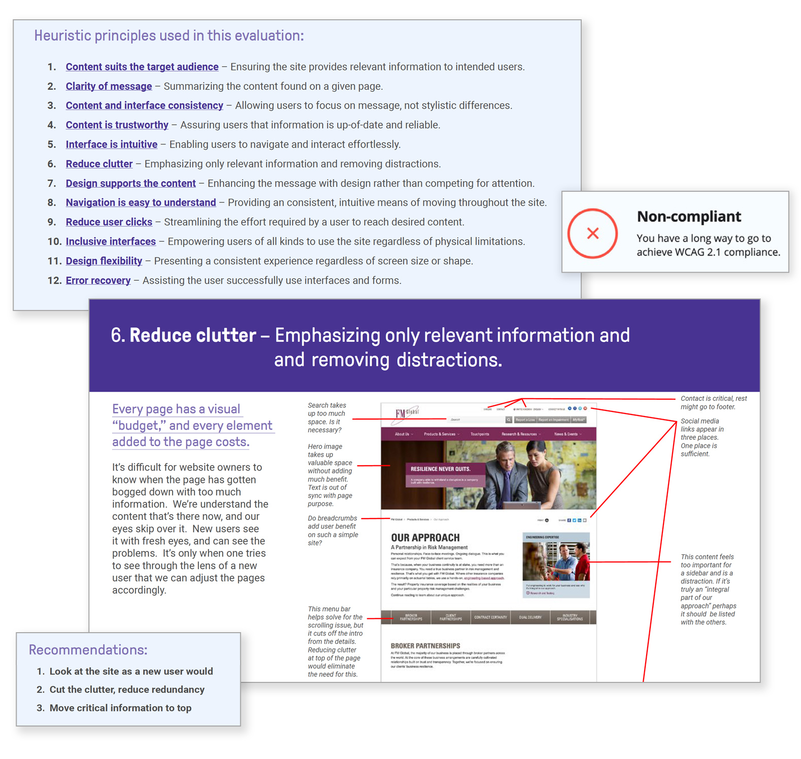
Heuristic evaluation of corporate site
Heuristic evaluations (reports using UX best practices as guidelines) are useful in diagnosing user pain points and proposing solutions. My evaluation was used to align siloed web teams, prioritize urgent fixes, and create a backlog focused on improvement.
Interview guide
I find surveys can produce a lot of actionable data, but when more nuanced feedback is necessary, interviews can yield invaluable insights. I created this interview guide to bring focus, maintain consistency, and help avoid the introduction of unintentional bias. (View complete PDF)
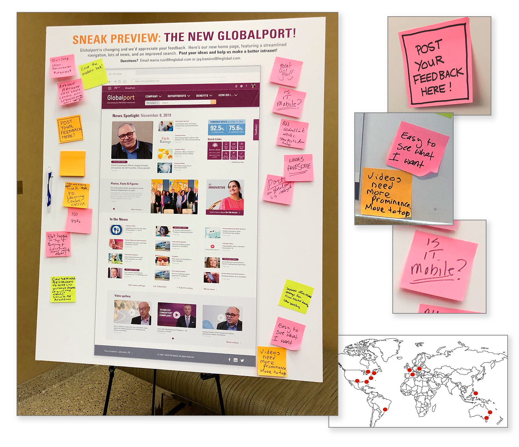
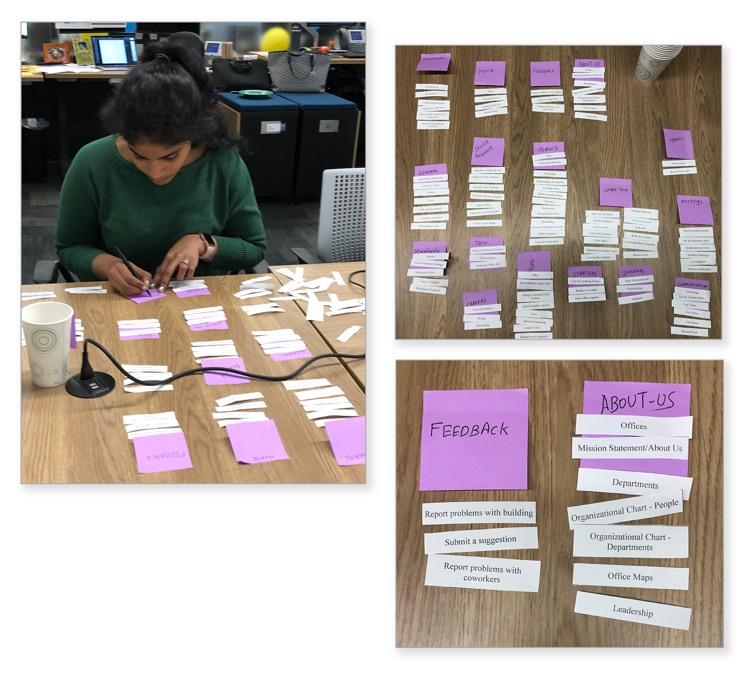
Paper-based feedback
Sometimes, the simple approach works best. To get feedback from the widest possible range of employees across the company, I created posters that were displayed in FMG offices worldwide. Post-its allowed for everyone to give input and feel heard, including employees that online surveys don't always reach. The resulting feedback was compiled and used to inform the next iteration of design.
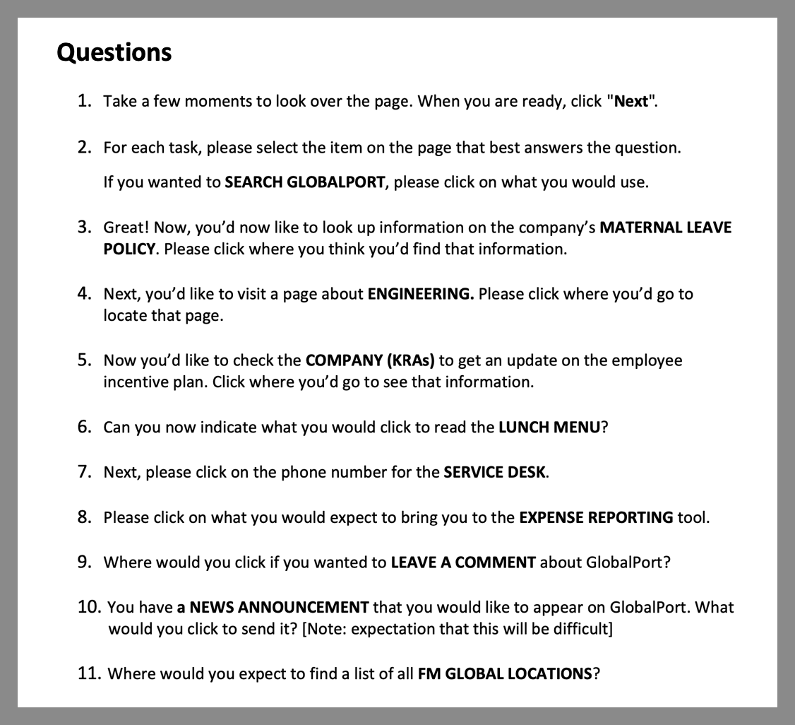
Paper-based navigation tree test
In concert with online tree testing, I conducted paper tree tests with several employees to see where they would look for information, letting them organize the content as they felt best while I observed and discussed ideas with them. Feedback from these tests, along with online version, informed the final site map.
Step 2: Research Analysis
Objective: Find meaning within the data and share it with stakeholders.
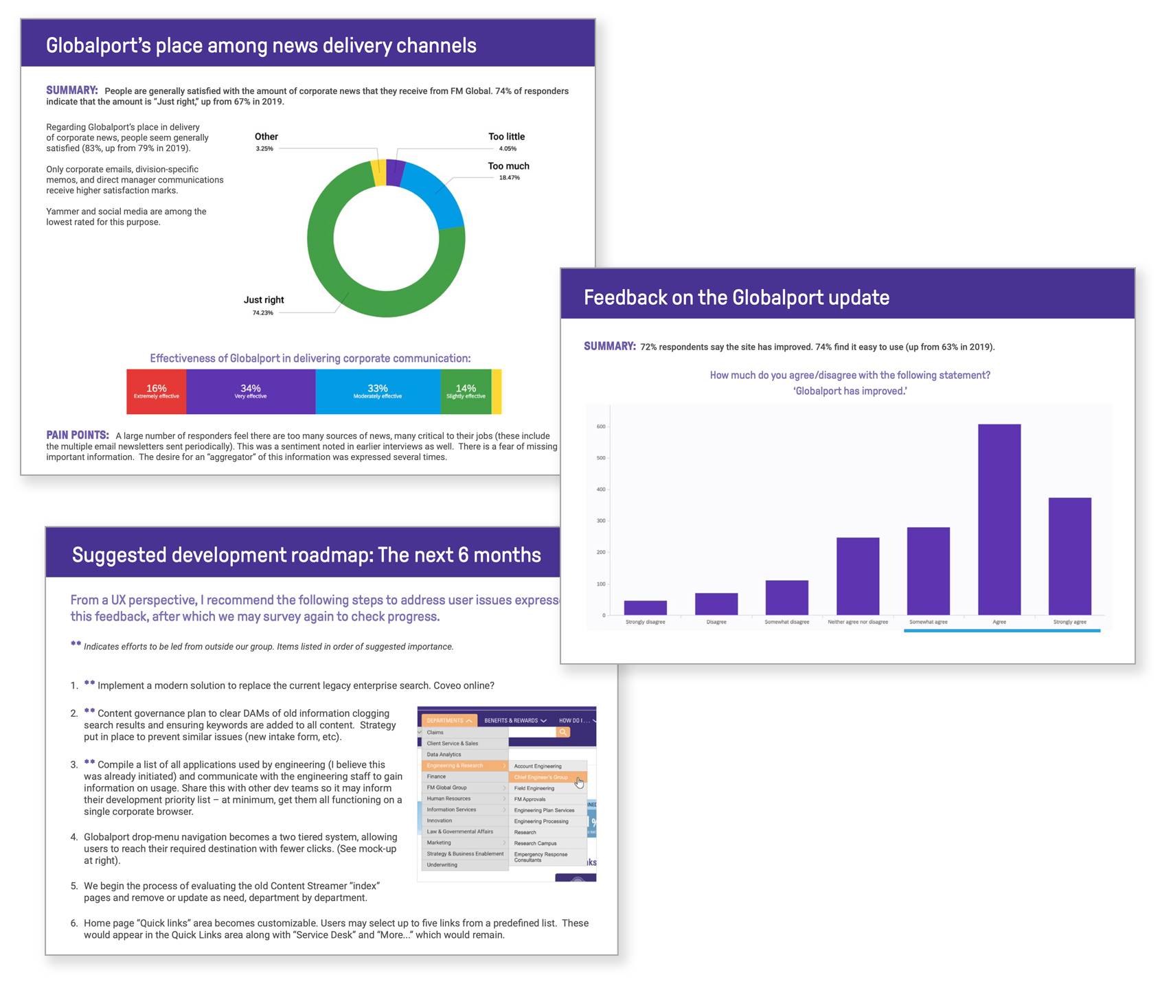
Survey report and analysis
I compiled the major themes found within the feedback, comparing the results against a baseline survey done the previous year. Feedback was prioritized, defined in user stories and added to the product backlog.
Interview feedback matrix
Visualization based on 21 interviews with current and former customers who navigated the current insurance claims process. The result detailed what users liked, what needed improvement, and potential new features, with user quotes to add context. Mural was used so stakeholders could comment and zoom in to see details.
Summary of product expectations
Visualization of what clients expect based on interviews. This simpler format was added to a slide deck for executives who wanted to understand the "big picture" take-aways.
Step 3: User Personas
Objective: Leverage research to create composite users that summarize user needs.
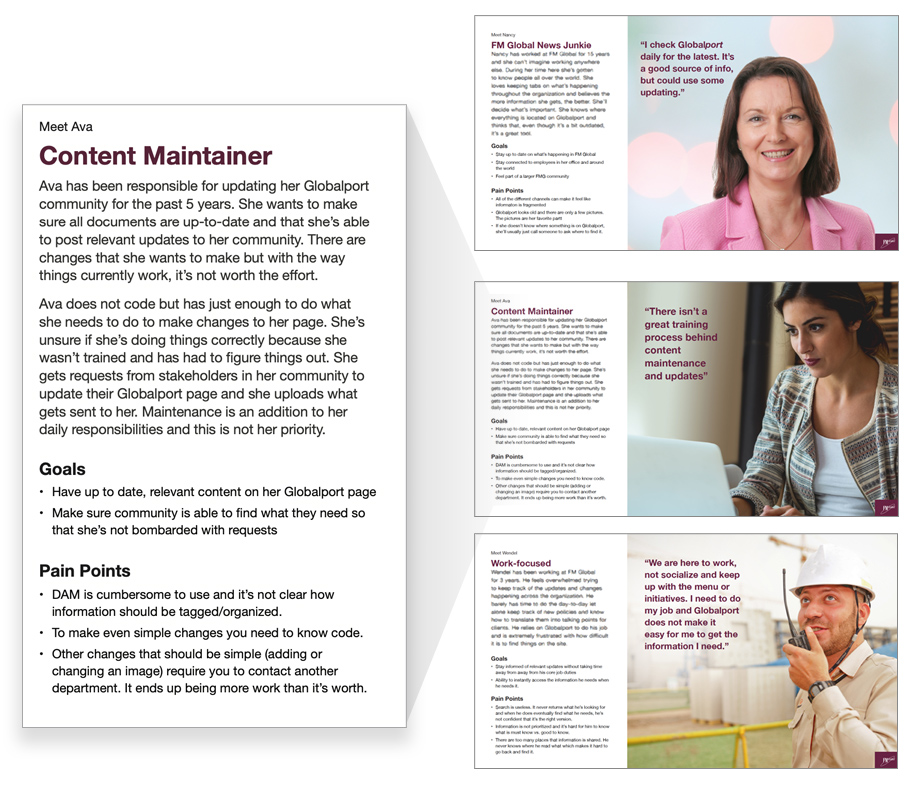
Detailed persona for corporate intranet users
Outlining the different expectations of the user base, why they use the site, and pain points with the current structure. I use detailed personas to inform new research studies.
Simple persona
One of several personas involved in the insurance claim process. I like to keep these simple, targeted personas on-hand during a project to keep the teams's focus on our most pressing user needs.
Step 4: Journey Maps & Business Blueprints
Objective: Understand what our personas are doing, thinking and feeling.
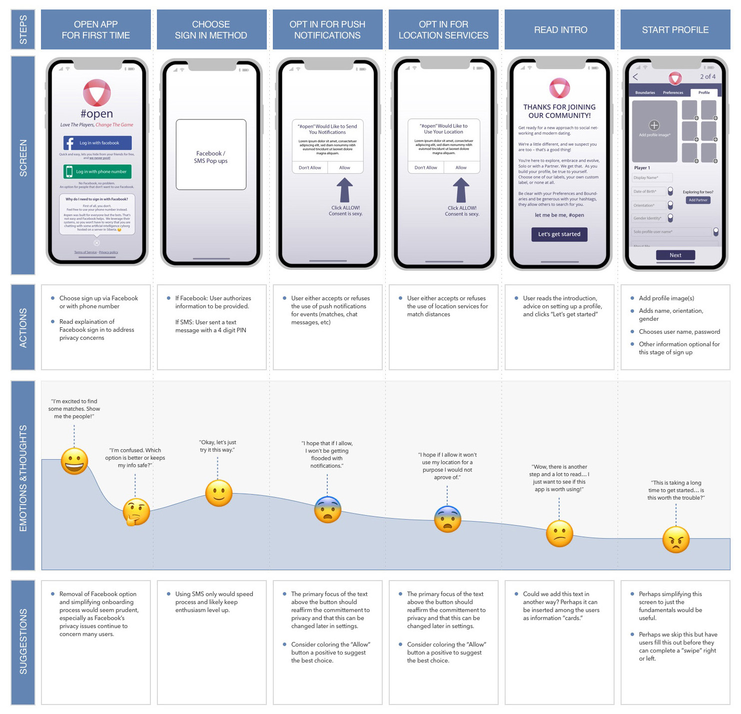
Journey/empathy map illustrating why people are dropping out of sign-up process
I used an empathy map here to illustrate the user's frustration with a complex sign up and suggest improvements.
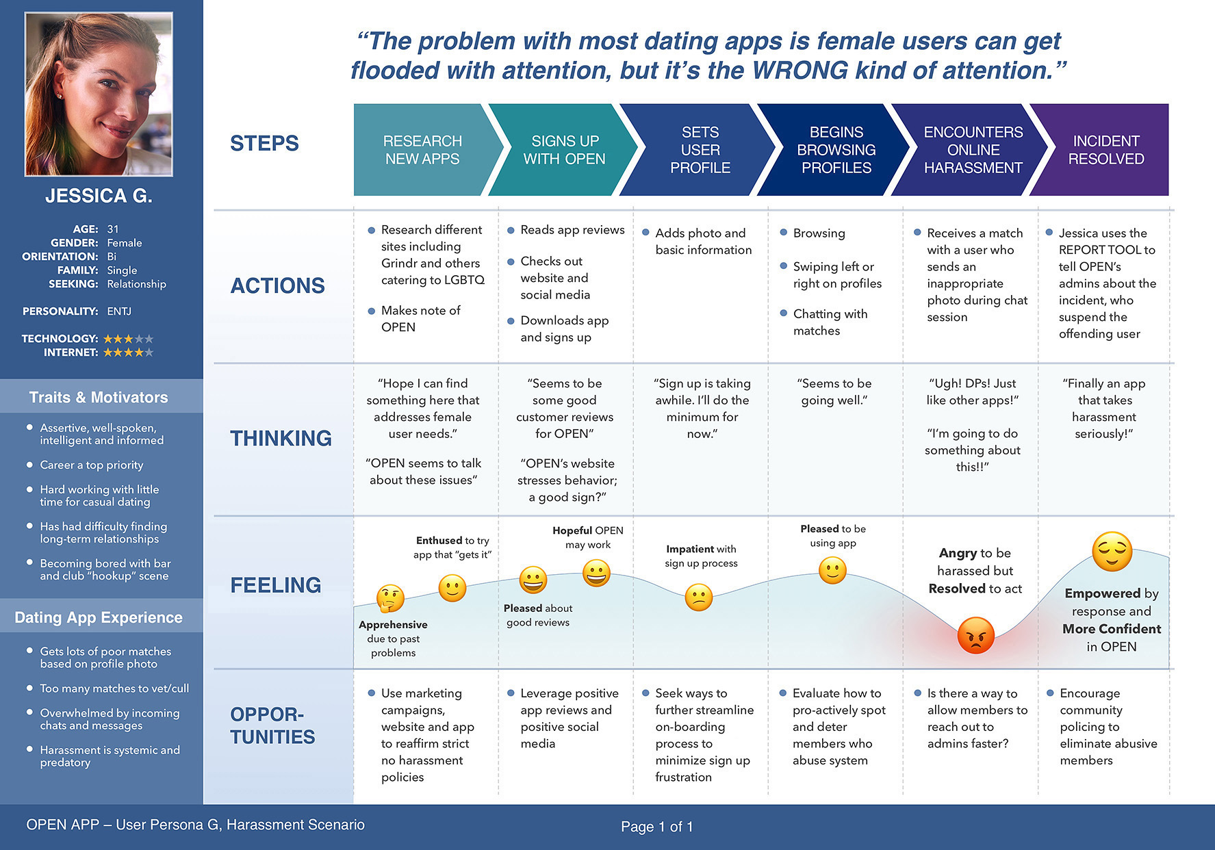
Persona-centric journey/empathy map showing a harassment situation and resolution
Harassment is an unfortunately common issue on dating apps, particularly for women. I used this journey map with the added persona to illustrate how this specific user type tends to be subject to harassment and what they are feeling as they seek resolution.
Business blueprint illustrating insurance claims process
Shows the complex, multi-departmental insurance claim process as seen by clients and internal staff. Created by myself, junior designers and business analysts based on our stakeholder interviews. Used to guide the effort toward an improved enterprise software solution.
Step 5: Wireframes & Flowboards
Objective: Illustrate the experience to align stakeholders and confirm direction with user testing.
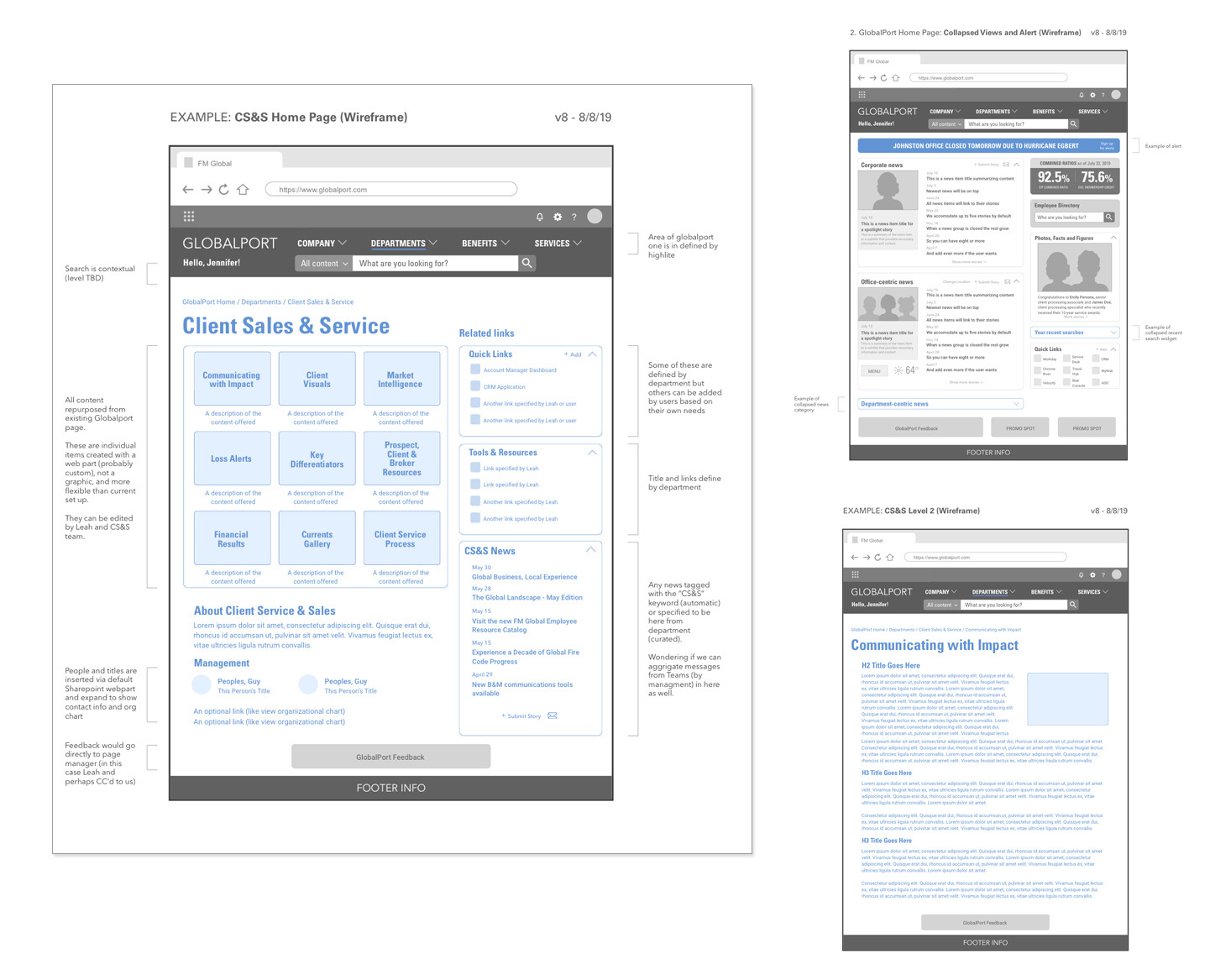
Wireframes for corporate intranet
Low-fidelity wireframes showing templates with dynamic content areas indicated in blue.
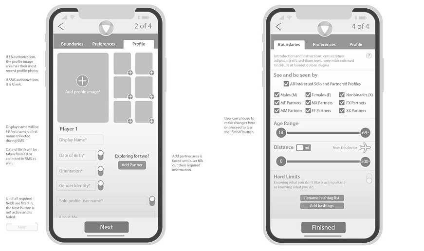
Mobile app screens showing profile preferences
Low-fidelity wireframes showing profile image uploading interface and matching preferences.
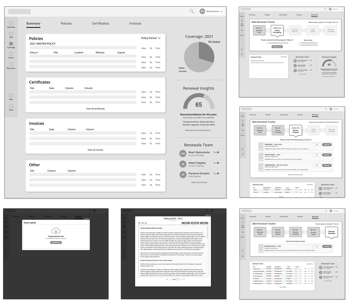
Enterprise software, renewals tracker
Low-fidelity wireframes showing the desktop version of process to renew insurance policies.
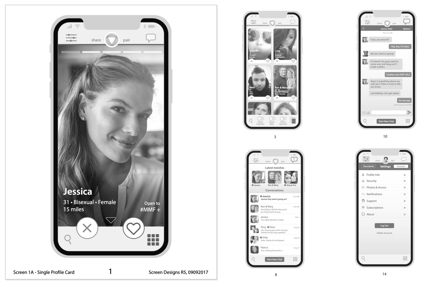
Mobile app screens including user profile and chat
Medium-fidelity wireframes showing screen samples from the Apple/Android app.
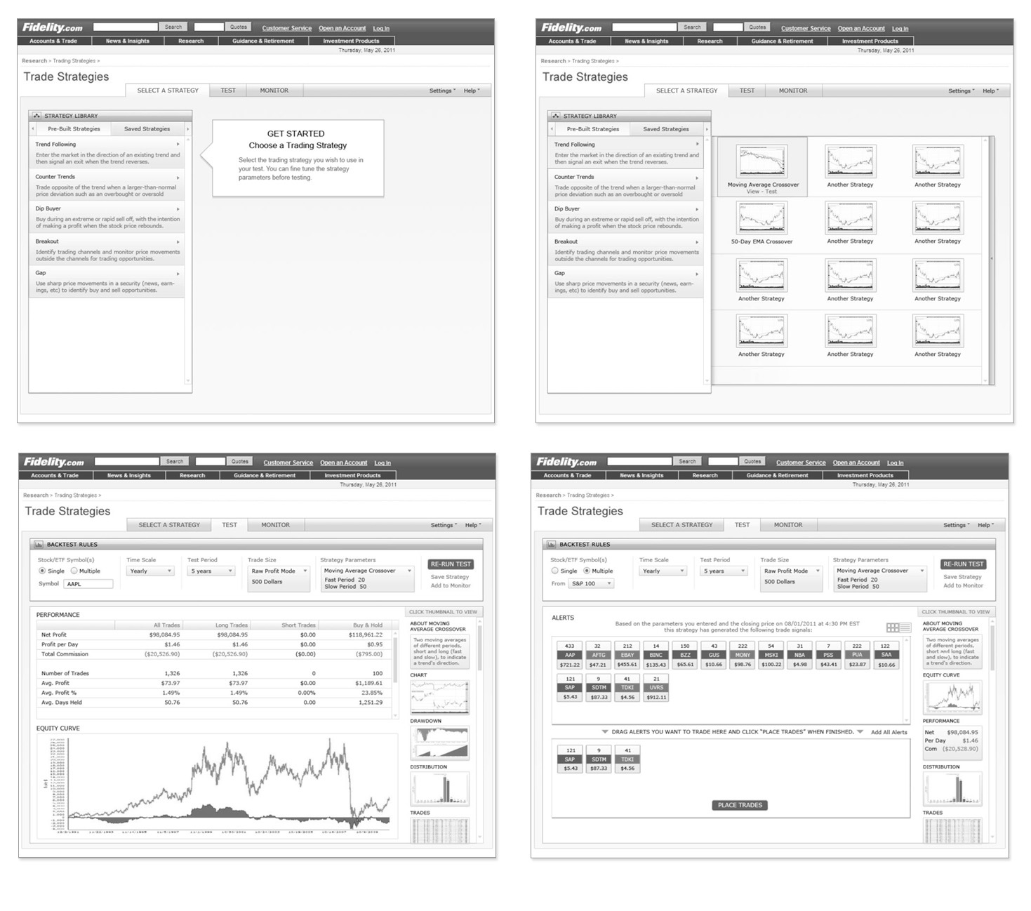
Trading strategies application, Fidelity Investments
Medium-fidelity wireframes illustrating screen layouts and navigation for a stock trading strategies application.
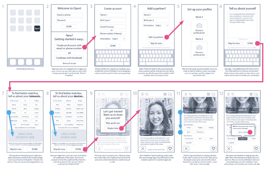
Mobile touch interactions
Low-fidelity flowboard to illustrate how a new user sets up their profile. This was the final step before building a clickable prototype for user testing.
Step 6: High-Fidelity Designs & Prototypes
View completed high-fidelity examples on the Projects page.